
Colour Palette
The Creative Sticker Co palette is designed to feel calm, familiar, and easy to mix and match.
Each shade is thoughtfully chosen to work across different styles - whether you love a clean neutral layout or layering soft, muted tones.
These are my everyday colours but now and then, I will release a Limited Colour Drops for something a little fresh, a little seasonal, and just for now.

A soft off-white with warmth. Light, breathable, and easy to layer with anything.

A neutral blush-beige - gentle and understated with a subtle pink warmth.

A warm, dusty pink that adds softness without feeling overly sweet.

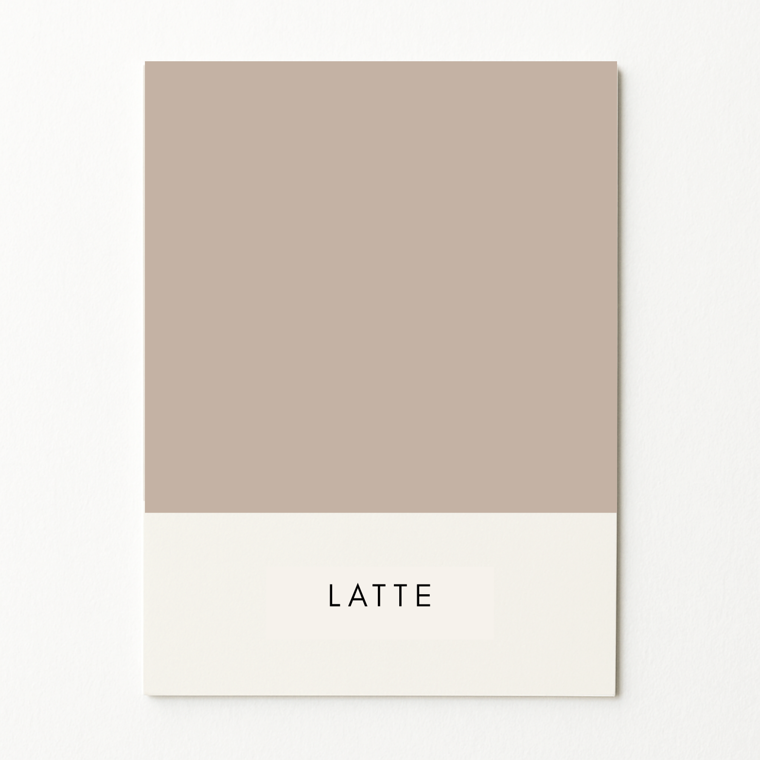
Sits between nude and taupe - warm, muted, and a little earthy

A muted mauve-grey, with just enough depth to feel moody but still soft

A warm mauve neutral that pairs effortlessly with both cool greys and earthy browns.

A dusty golden beige that brings natural warmth and balance to any layout
A soft mid-tone neutral with warmth — sits comfortably with both greys and browns

A rich, muted brown - warm without being too deep or heavy

A warm deeper peach tone with a softened, slightly sun-faded feel

A pale, soft green with a cool undertone — fresh and calming

Muted and earthy - a go-to soft green that pairs well with everything

A deep, cool-toned green with a natural, grounded feel

A light, clean blue - calm and clear without being cold

A strong, true navy — dark, dependable, and perfect for contrast

A pale, clean grey - minimal and light, with a soft matte feeling

A cool grey mid-tone - modern, smooth, and easy to mix into neutral palettes

A cool-toned light beige - minimal and grounding without leaning grey

A deep charcoal-black - rich and grounding without feeling stark